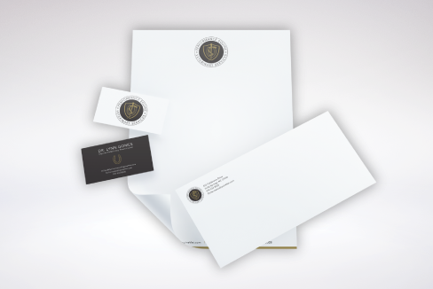
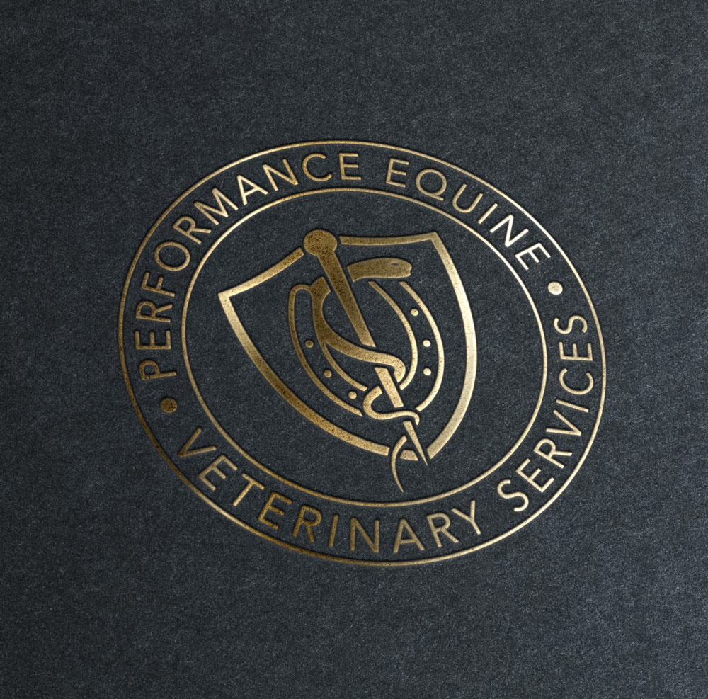

Performance Equine is a high end veterinary service which came to Krash Creative looking to start their brand off properly. The end result is a brand that feels luxurious in every aspect, from the logo and stationery, to the website.
The Logo Design concept started from looking at Ivy League schools, and how their branding represents their virtues in a very convincing way. Horse care is expensive and is a luxury for most people, so the branding of the veterinary care needs to match.
We wanted Performance Equine to have the same look and feel, but also represent the practice at first glance. The result was a combination of the caduceus, shield and 'U' shape of the horse hoof.
When we moved onto the Web Design for Performance Equine, we already knew we wanted to continue the high-end feeling we started with the logo and branding across tot he website. We did so by utilizing sharp and minimal photography, while layering on top a wooden texture reminiscent of a stable. The end result is a simple website that is easy to navigate, but captivating to the viewer.
